
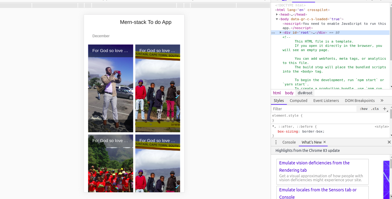
如何使Materia-UI GridList在移动设备上垂直面对一行? 我的GridList是一排两个,这是我想要的,但当我在移动端查看它时,它仍然显示是一排两个,而不是一个。 这意味着它没有响应能力,我怎么让它有响应能力呢?
这是我的事件组件。
import React from "react";

import { Link } from "react-router-dom";
import axios from "axios";

import GridList from "@material-ui/core/GridList";
import GridListTile from "@material-ui/core/GridListTile";
import GridListTileBar from "@material-ui/core/GridListTileBar";
import ListSubheader from "@material-ui/core/ListSubheader";
mport IconButton from "@material-ui/core/IconButton";
import Button from "@material-ui/core/Button";
import { withStyles } from "@material-ui/core/styles";
import Typography from "@material-ui/core/Typography";

const useStyles = (theme) => ({
 root: {
  display: "flex",
  flexWrap: "wrap",
  justifyContent: "space-around",
  overflow: "hidden",
  backgroundColor: theme.palette.background.paper,
},
gridList: {
  width: 1000,
  height: 950,
},
icon: {
  color: "rgba(255, 255, 255, 0.54)",
},
});

class EventsList extends React.Component {
constructor(props) {
  super(props);
  this.state = { events: [] };
}

componentDidMount() {
  axios
    .get("http://localhost:9000/events/")
    .then((response) => {
      this.setState({ events: response.data });
    })
    .catch(function (error) {
      console.log(error);
    });
}

render() {
const { classes } = this.props;
return (
  <div className={classes.root}>
    <GridList cellHeight={330} className={classes.gridList} spacing={8}>
      <GridListTile key="Subheader" cols={2} style={{ height: "auto" }}>
        <ListSubheader component="div">December</ListSubheader>
      </GridListTile>
      {this.state.events.map((tile) => (
        <GridListTile key={tile.eventImage}>
          <img src={tile.eventImage} alt={tile.title} />
          <GridListTileBar title={tile.title} titlePosition="top" />

          <GridListTileBar
            paragraph={tile.description}
            actionIcon={
              <IconButton
                aria-label={`info about ${tile.title}`}
                className={classes.icon}
              ></IconButton>
            }
          />
        </GridListTile>
      ))}
    </GridList>
  </div>
);
 }
}

export default withStyles(useStyles)(EventsList);
由于您使用的是基于类的组件,因此可以使用withWidth将cols值有条件地设置为gridlist。
请参阅此处codesandbox中的工作示例
示例代码段
class TitlebarGridList extends Component {
  render() {
    const { classes, width } = this.props; // <---- see here
    let columns = width === "xs" || width === "sm" ? 1 : 2;
    console.log("=========>", width);
    return (
      <div className={classes.root}>
        <GridList cellHeight={200} className={classes.gridList} cols={columns}>  {/* //<---- see here */}
          <GridListTile key="Subheader" cols={3} style={{ height: "auto" }}>
            <ListSubheader component="div">December</ListSubheader>
          </GridListTile>
          {tileData.map(tile => (
            <GridListTile key={tile.title}>
              <img className={classes.image} src={tile.img} alt={tile.title} />
            </GridListTile>
          ))}
        </GridList>
      </div>
    );
  }
}

TitlebarGridList.propTypes = {
  classes: PropTypes.object.isRequired
};

export default compose(
  withStyles(styles, {
    name: "TitlebarGridList"
  }),
  withWidth() //<---- see here
)(TitlebarGridList);
注意:withwidty在将来某个时候将被弃用,因此考虑使用useMediaQuery钩子(在这种情况下,您必须切换到functional component)。